LinkedIn Headquarters: An Interview with Robert Norwood of NBBJ
We sat down with Robert Norwood, Principal and Interior Design Leader at NBBJ, who led LinkedIn through the iterative process of creating an adaptable and dynamic space for their new headquarters, Building 1.

Tell us about how the design for this space evolved with the client.
This project planning initially began using LinkedIn’s space guidelines as they were before COVID but was revised during the pandemic as employee needs and preferences evolved. The client asked us to help visualize how the space could be adjusted without altering the interior architecture. We spent a great deal of time mapping out and identifying vignettes that would work for a variety of uses. To do this, our team created a postures matrix, as mentioned in this Fast Company article. This is a tool that guided our decisions for what types of alternative work points and varied other settings might be needed, to include focused, individual work, social activities, small and larger collaborations and meetings. We made choices about the types of ergonomic support and how much of each activity would need to be supported based on this matrix.
In doing this, we looked at how to identify what vignettes would be useful and inviting. We didn’t know at the time how many hours or days per week individuals were actually going to spend in the office, so our strategy was to accommodate as many postures and seating type we could think of. In total, there were about 65 (!) different types of settings that we then used to ideate the design.
Was this different than how you designed for LinkedIn in the past?
This structure was one of three new buildings for LinkedIn’s site and is essentially the front door to the campus. LinkedIn’s B1 is intended to help bring employees closer together, not in terms of density, but rather in a collaborative sense to complete projects or enjoy social gatherings. Historically, most clients before the pandemic looked at office space on how to efficiently fit the maximum number of employees. Instead of looking at the quantity of individuals in using a space, we’ve made the shift toward making the time in the space of a higher quality experience, focusing on comfort, productivity, flexibility and choice so those who are in the office can do their best work.
How do you feel like these new standards will impact how you design for other tech clients in the future?
We are capturing and analyzing data to see what settings are the most utilized in B1. This is being done via sensors throughout the spaces to collect use data – and this data will continue to inform the standards we set for workplace design.
In many ways, this project sets the bar for similar companies. It is highly visible in the industry with a great deal of press, such as articles in the New York Times, Wall Street Journal and Harvard Business Review.
We are at a place in the market where many clients are curious to see how things will progress and change post-pandemic and are waiting to see what other companies are doing. At the same time, a lot of companies are being cautious to avoid risk, and these new projects are showcasing a resilient, flexible model.
What are you most proud of for this project?
The adoption by the users of new space settings is something I feel very proud of. There are several types of spaces in this project that were new even to us – such as the flex zone mentioned in the Wall Street Journal article. We looked at how we could create a space that the engineers at LinkedIn could manipulate and change to address immediate changing work needs without having to involve facilities; and a space that fell between enclosed collaboration and the privacy of a traditional workstation. The result was to create an easily customizable space is that employees can shift to create room for close collaborations without delays, without completely changing the setting.


What is the overall aesthetic of the space? Do you have a favorite feature of this project?
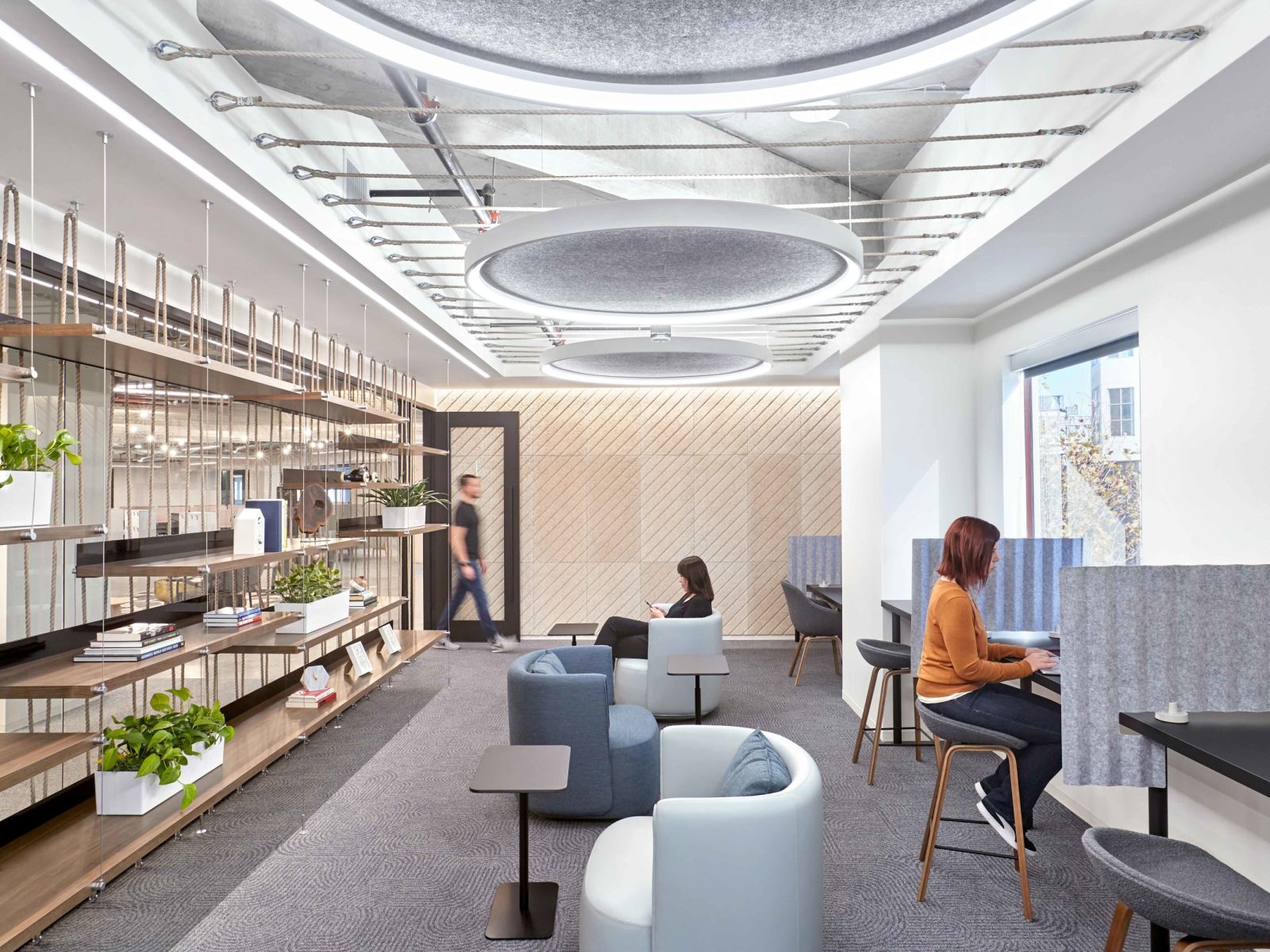
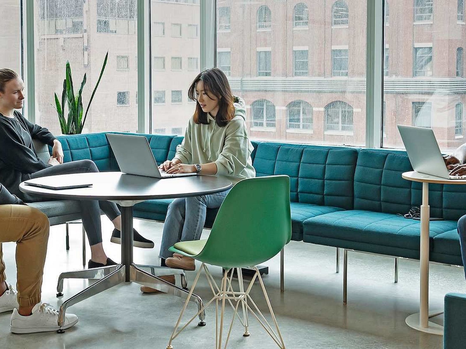
The project is tailored to diverse employee preferences with a variety of unique spaces — from cozy niches for heads-down work to informal “living room” hubs for team collaboration. One of my favorite things about this space is the strategy around the aesthetic of the furnishings. We were careful to curate items that would make the office feel better than home – such as sofas and varied lounge seating – that would feel less corporate but still support the human posture.
We incorporated large planters to bring biophilia into the space that also lend inviting sculptural details. We layered spaces with area rugs, artwork, and objects. We also worked to right-size conference rooms for the number of people actually using the rooms and to appropriately support those activities, from larger zones for team meetings to much smaller, individual-use rooms. With hybrid, in-person and remote teams, there are a number of different types of AV communication and other technologies to make collaborations equitable and democratic for all involved. I believe this rightsizing will be a trend we see going forward, with far fewer large rooms and instead, smaller, four-to-six person meeting spaces as well as individual focus rooms.
From a human perspective, how do you think employees are responding to the design of the space?
One interesting aspect of this project was the make-up of LinkedIn’s workforce, which is approximately 80% engineers and 20% that perform other job functions. The engineers are typically coding and creating content as well as managing the website. We had to go back to our postures matrix and find ways to support their work and the needs that these individuals have, but also create spaces that help encourage interaction in a way that best suits their personal needs.
One space planning strategy we used was to shift circulation into and around the neighborhoods from the core to the perimeter. The intent was to manage exterior light distraction, intending to keep the blinds open and gain more access to the biophilia surrounding the building.
Another driver from a planning perspective was that we wanted to maximize the use of certain spaces throughout the day by increasing or decreasing seating, and how we placed spaces in proximity to each other – such as a pre-function space next to food and beverage areas. This was done to spark steady activity throughout the day, increasing the chance that employees might cross paths with a colleague that they may not interact with otherwise. The idea behind this is similar to social spaces like a bar or a coffee shop where individuals would convene outside of work, and potentially have conversations that foster career growth, new relationships or creative ideas away from the desk.


