FRESH Perspectives: LinkedIn SF
An Exclusive Look Inside LinkedIn's New SF Office with Neil Schneider, IA Interior Architects


Looming above San Francisco's SoMa district, LinkedIn's impressive new building has been the talk of the town since its opening. We had the opportunity to sit down with Neil Schneider, Design Director of Interior Architects, for an exclusive look inside LinkedIn's newest (and perhaps coolest!) office.
What is Interior Architects' history with
LinkedIn?
We have been fortunate to have the
opportunity to work with the team at LinkedIn for the past 4 years. On this journey, the team has built out
projects from coast to coast and in a variety of countries. Our first project was the renovation/addition
to the Chicago office which quickly spread to assisting in New York, Toronto,
Sao Paulo, Dubai, and of course the Bay Area.

Chicago, Toronto, and New York -- Are these
spaces all distinctly different?
We try to keep every facility
special with a subtle nod to its local surroundings and culture. This keeps the
environments fresh and interesting while embracing the overarching LinkedIn
cultural experience and workplace strategy guidelines.
The Chicago office was designed around a common thread connecting the broad generations of their users. We used thread to create the logo in the lobbies and it unwound to create a lot of the signage throughout the space. There is also an entire wall next to a staircase that has vintage headshots that connects the two floors. The design team used the profile pictures from every decade to create visual interest as you walk up the stairs. My favorite are the ones from the eighties. I love the hairstyles and formal business attire.
In the Toronto office, we surveyed the employees to come up with a concept around building an urban retreat within the city. The employees enjoy spending time outdoors and with their colleagues in the surrounding communities. They tend to escape and go to the outdoors. But in the winter, they still wanted the office to reflect these ideas. Our design team played with materiality throughout the space. Conference rooms designed to look like air streams, birch wallcoverings, and even a fire pit for group collaboration adorn the facility. We tried to bring the outdoors in.
New York’s facility is based off of the world of underground clubs and social societies of New York. It has a very different flavor. It gives the employees a sense of discovery with the office. There’s a rotary phone wall that hides one of the group meeting spaces. If you know the correct phone, you can dial a number that opens a door to the space!
Tell us about the themes in the SF
building.
222 Second [LinkedIn SF] took themes
to a whole new level with each floor having a specialized theme based on the
city. The team looked at everything from coffee roasters to obscure city parks and
started mapping out the building. The space should not only create a fun
experience for the users, but also teach them a little more about the city they
work in.
For the movie floor, we wanted to create a special experience that ended in the media room watching the movies with your team. We researched all the movies filmed in the city and created a collection for the team. The designers bought two copies of each of the videos. One copy was added to the video collection in the library and another copy was glued to the wall to craft a textured graphic.
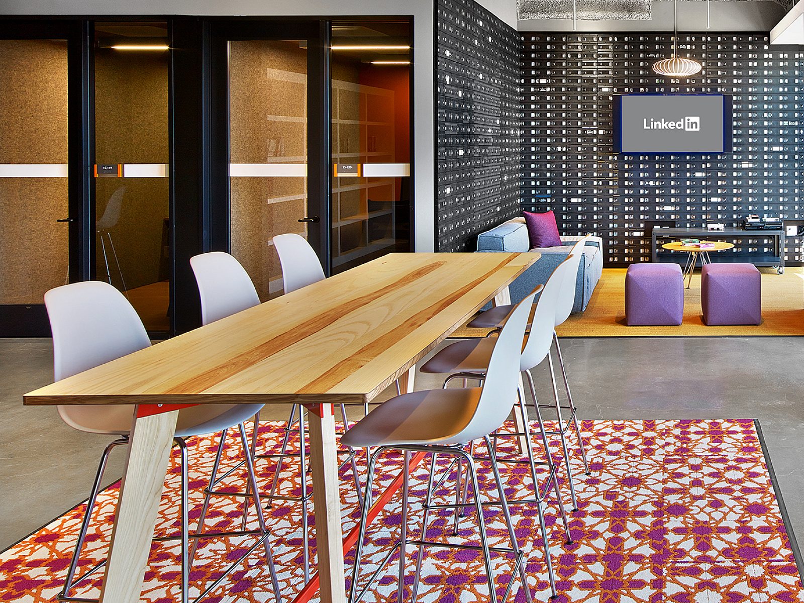
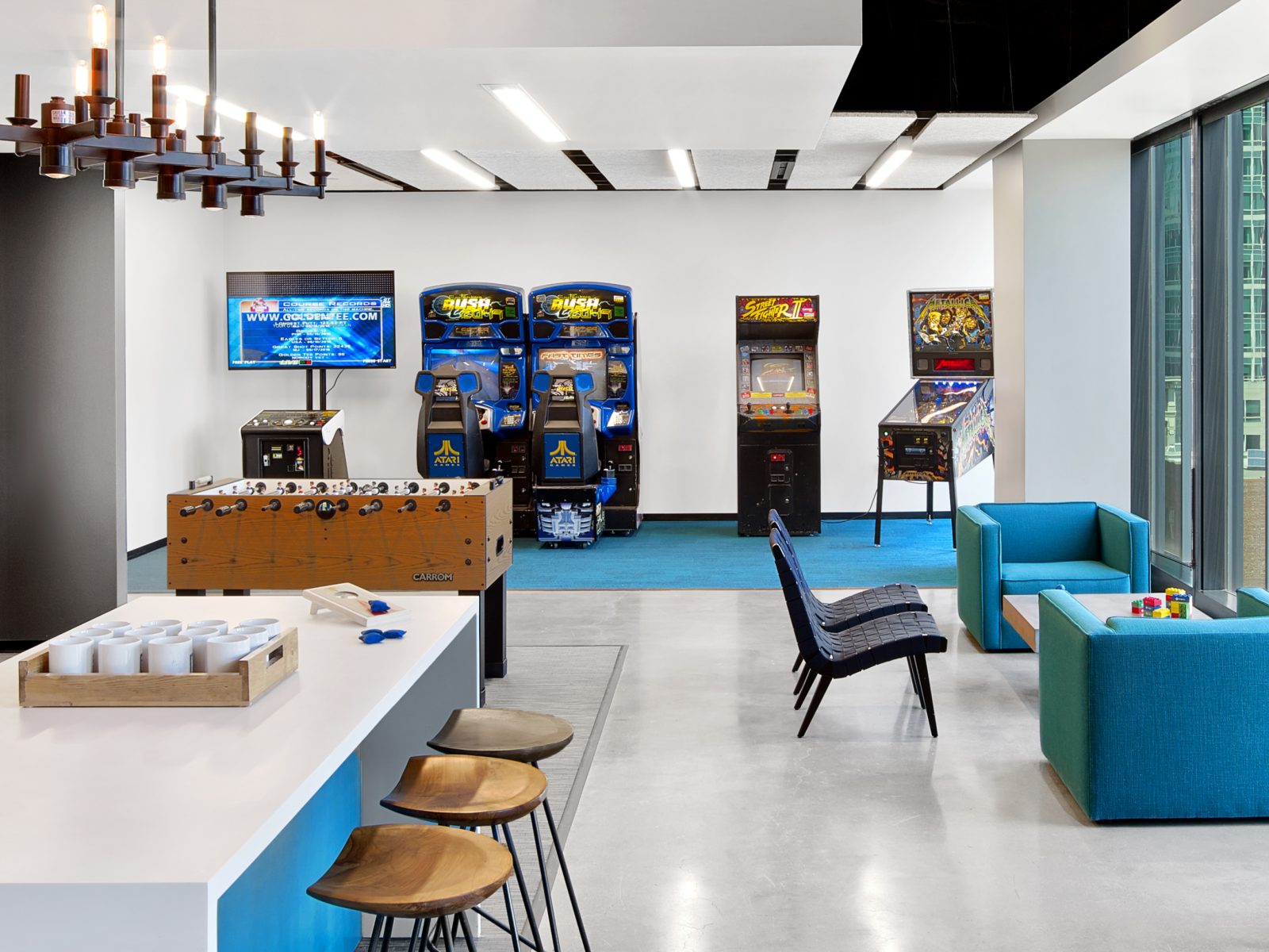
For our early San Francisco gamers themed floor, our design and experiential graphic design group researched the history of gamers in SF: who they are, what games they created, where the games are set in the city.
Do you have a favorite floor?
One of my favorite floors is based
on San Francisco poets. The graphics
team created a trail of clues through the floor from the pages of their works. They
wanted people to piece together the titles of the books, authors, and quotes
through the space. On one side of the
building there is a writable graphic wall that has quotes displayed on it; the
other side of the office has the authors names on it. The staff is encouraged to get a copy of the
books from the library on the floor and piece together the elements. Not only
are they great graphic elements in the space but they also assist in stretching
the minds of the staff at LinkedIn.

How is LinkedIn taking health and wellness
to new heights?
Wellness is a big topic for a lot of
companies and LinkedIn is no exception. The health & wellness group at LinkedIn looked holistically when
they designed the programs. From food to
fitness, this building has you covered. The
fitness center has trainers on staff to help with nutrition advice as well as
workout routines. The 24-hour center has a large group fitness room, massage
suite, cardio area & free weight area to help employees recharge as needed. There are also wellness suites on every other
floor of the building with mother’s rooms, prayer rooms, and gender neutral
restrooms.

How is the space specifically designed for
the workers of LinkedIn?
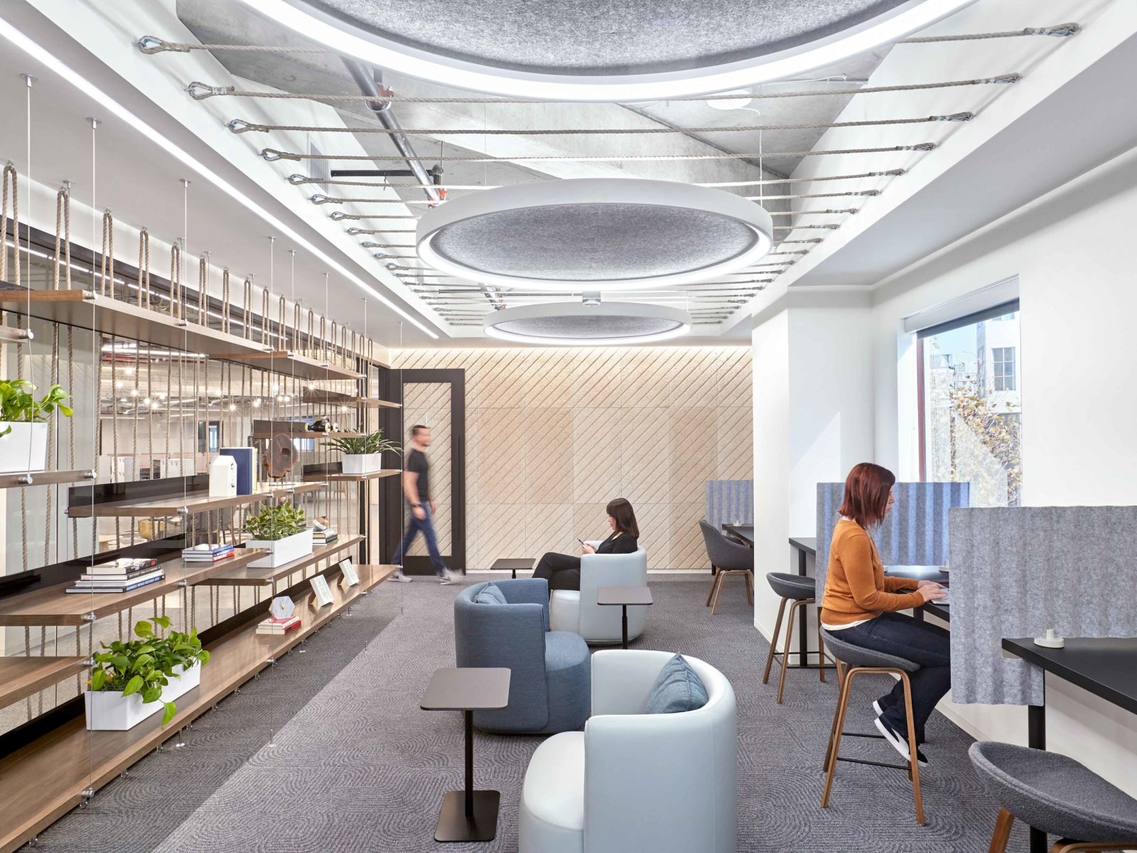
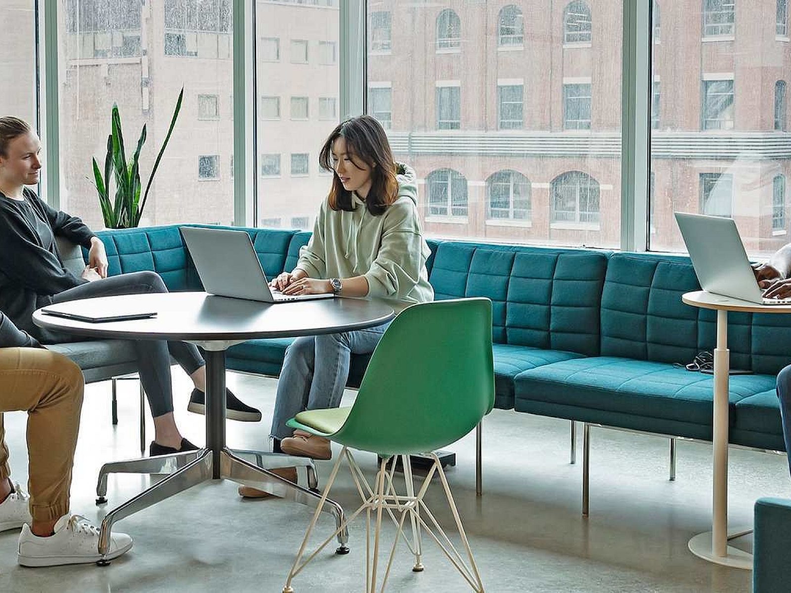
The space is designed to allow the
employees to work more freely together. The teams tend to travel in groups
throughout the building. We worked hard
to develop a large amenity package of spaces that allowed them not only to work
in a more collaborative fashion, but to also relax together. There are active and quiet relaxation zones
that are used for groups to get away from their desks and recharge a bit before
they get back to the grind of the work day. We strived to make work a little more pleasurable and build better
friendships among colleagues. Grab some coffee and play a game of pool, or
maybe a cup of green tea and meditate after a hard meeting with your team.

Tell us about how employees are
engaging with the new space.
There's
an interactive art wall on every floor right off the elevators to introduce the
staff to the overall theme of the floor - a pixel wall, a fortune cookie
display, a silent disco, and even a coding wall where people can send messages
through code. All conference rooms have smoked glass walls for marker boards
and textured acoustic wallcoverings, making them cool but functional. Every finish
was selected for a reason; whether acoustic, interactive, or designed to engage
the staff in thought.

The environmental graphic design team created a framework in the building to allow the staff to engage the building in a little different way. We knew they’d decorate and change things because that’s who they are. So putting in a structure to allow for that seemed to work well. They love the idea of discovery. So we asked, how do you build discovery? There is so much within our space to learn. Our Communications Team was sending out fun facts and asked questions such as, “Do you know how many ships are buried in San Francisco? Check out the eighth floor for information!” And if you go to that floor, you’d find out all that stuff! So it’s about getting people to know the building and experience it in a different way.

How did you balance nature with the urban
setting of SF in this space?
The San Francisco project looked
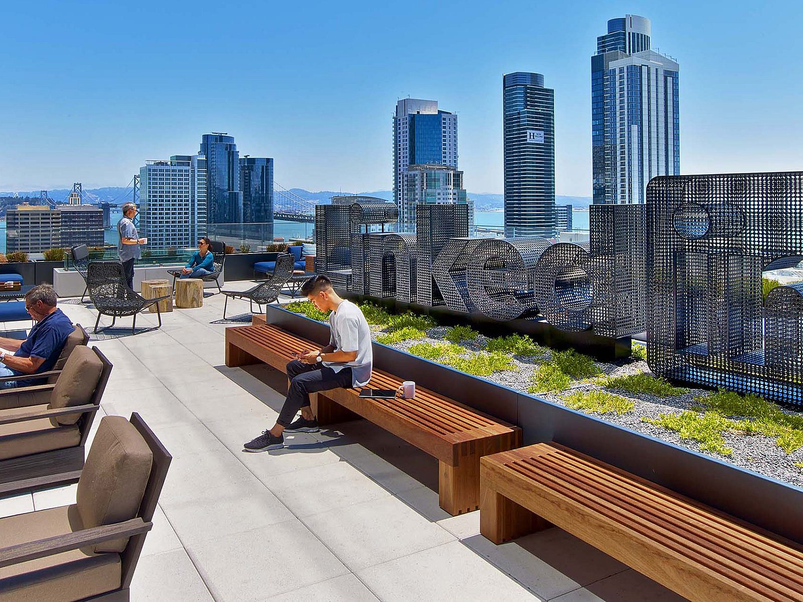
more to the SoMa Neighborhood than the beautiful landscapes of the Bay Area. The lobby on the first floor opens out into
the street with sliding walls to allow the street life to flow in and out of
the building seamlessly. It was
important to help activate the street and blend the corporate environment into
the city. In the interior of the office
space, we looked to urban street art to develop the finish palettes. We engaged local artists to develop custom
art pieces for the elevator lobbies.
Are there any trends you’ve learned from
this project with LinkedIn?
LinkedIn is looking forward to
setting the workplace trends for companies across the world. They look at everything from the nutritional,
mental, and physical well-being, technology integration, dynamic teaming, and
embracing the arts. I would say our team learned a ton from this project about
looking deeper into a company to understand the real needs of their employees
to work better.
To learn more about this amazing project, check out the LinkedIn San Francisco project profile!
Photography by: Eric Laignel
Pivot LinkedIn Account Executive: Joel Mitooka


